Project Info:
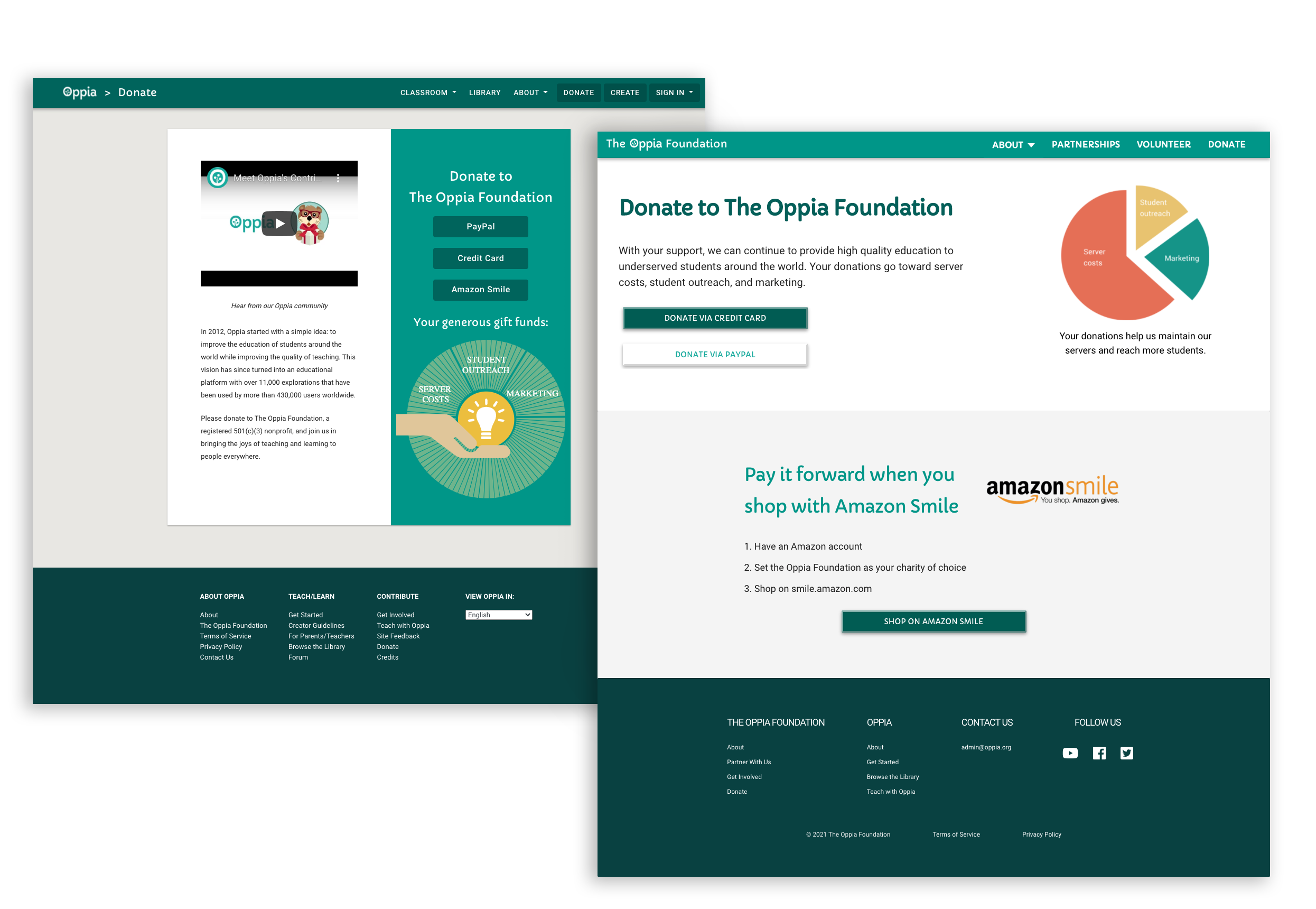
The challenge that was launched was to bring the two different donations pages into one (desktop and mobile version). One of the pages was part of the foundation website and the other from the organisation website.
My task was to bring them together while also improving the experience for the user and raise the donations, while keeping the overall website language and respecting the constraints was essential.
Challenge
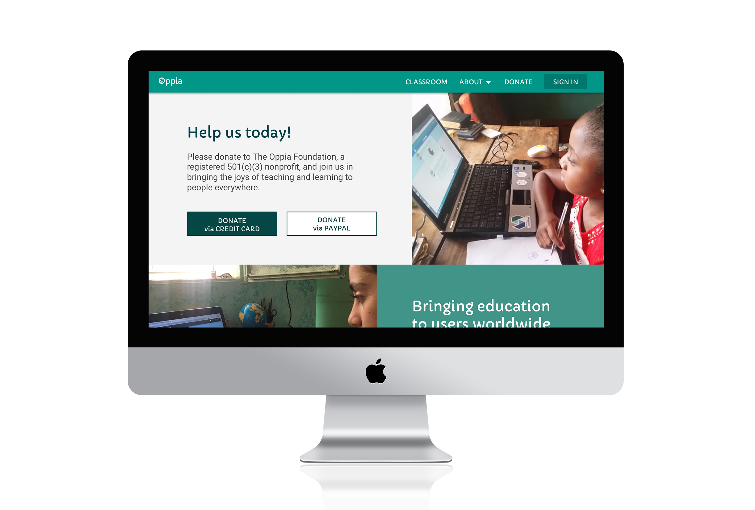
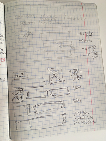
My proposal was based on answering the questions how and why, and adding an emotional appeal. Together with the project coordinator we’re able to create a page divided into three chunks of information:
- Help & How
- Why
- Secondary help
My focus was mainly one, bring emotion to the table!
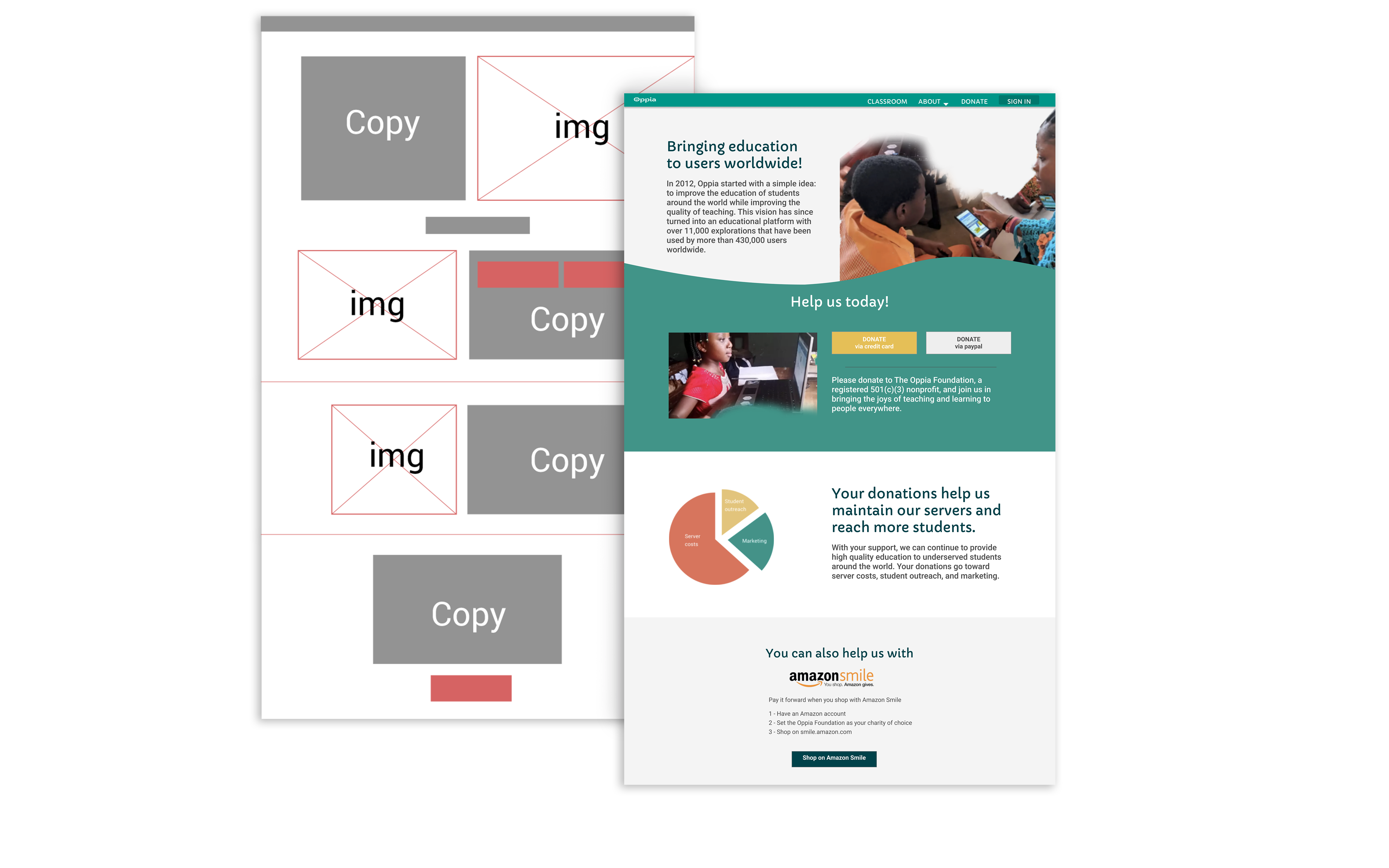
From left to right: Organisation Website, Foundation Website
Sapere aude - “Dare to know”
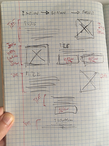
Immediately after receiving my brief I remembered about some of the materials I had learned from the Interaction Design Foundation, so I decided to base my solution in researching the following:
- 1. Emotional appeal,
- 2. Reasoning,
- 3. Result,
- 4. and of course in my experience in e-commerce (let those CTAs steal the show).
After my research I made the decision that the following points would be my “north stars” for the project:
- “Buy it now! The Instant Sales Technique”
- “Pictorial Superiority – A Picture May be Worth More than 1,000 Words”
- “Offer Visual Cues as to Where to Look”
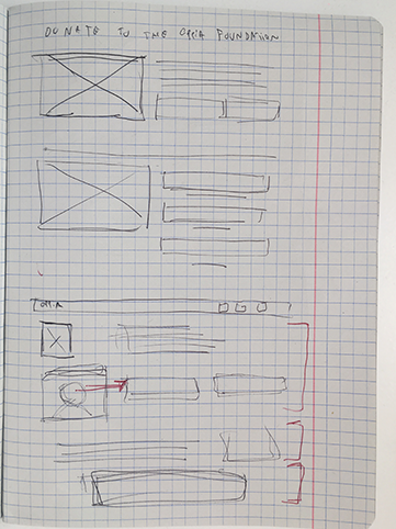
First Draft
On my first approach I decided to divide the page into three sections
- 1. Who we are - Introduction & How to Help - Guide User
- 2. Why to Help - Additional Info
- 3. Final appeal - Additional Help
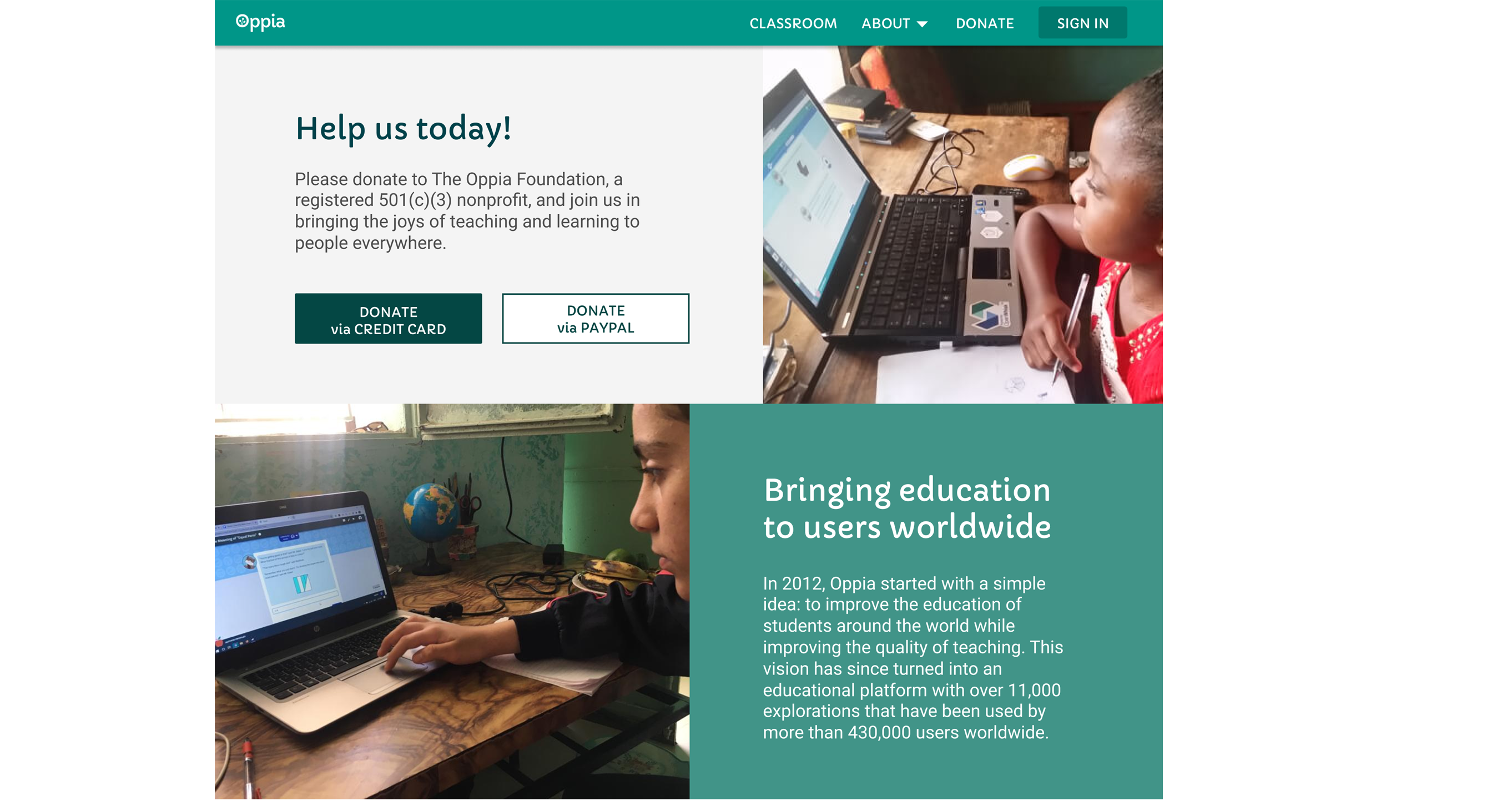
Adding an organic shape between section one and two, made the transition more fluid, and conveyed the idea that both were actually an unified piece of content. I built my content in three chunks and let those images bring emotion to the page, which was a big issue for me with the previous versions.
Ad astra per aspera - "Through adversity to the stars"
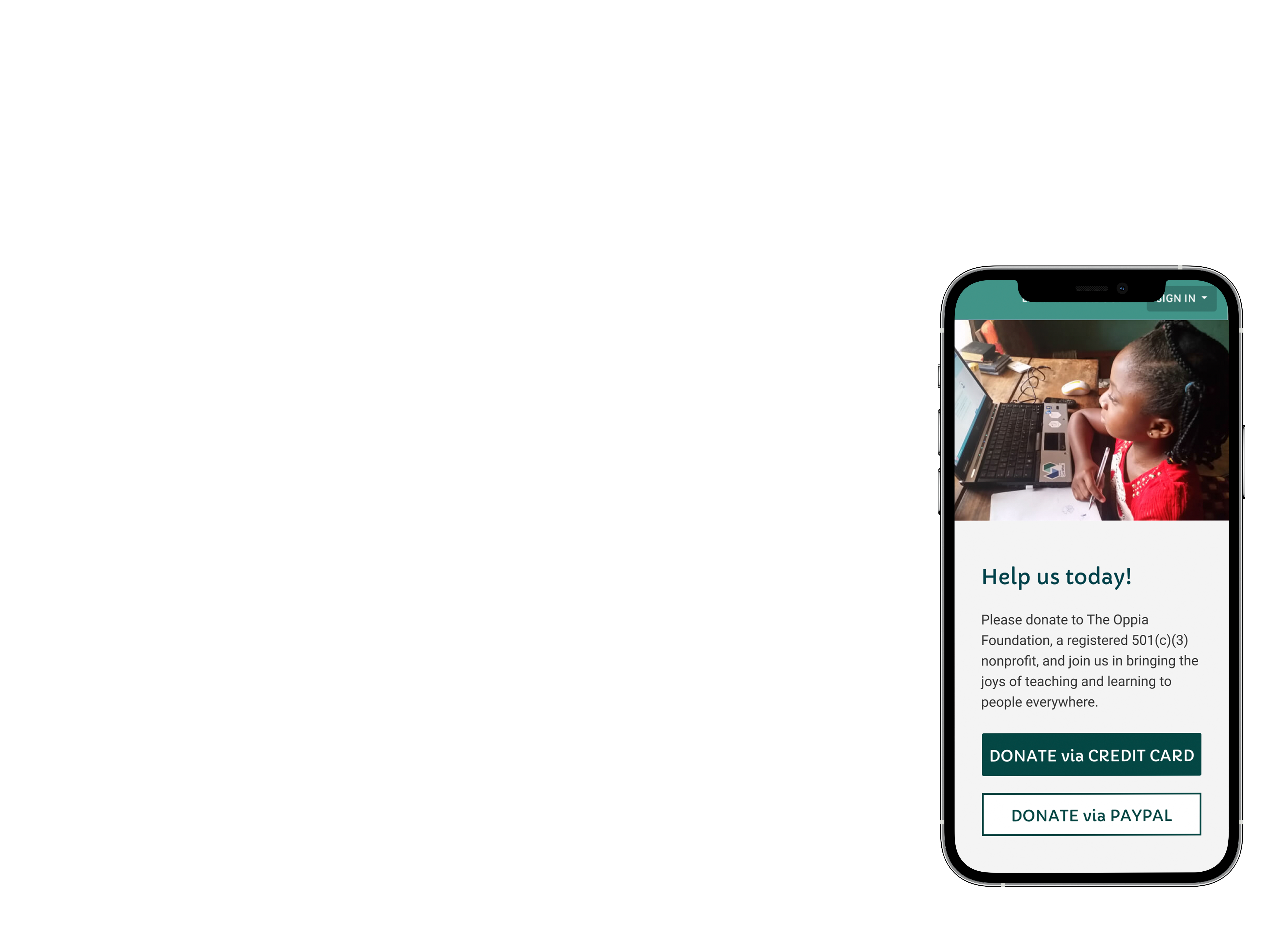
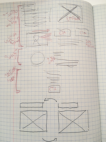
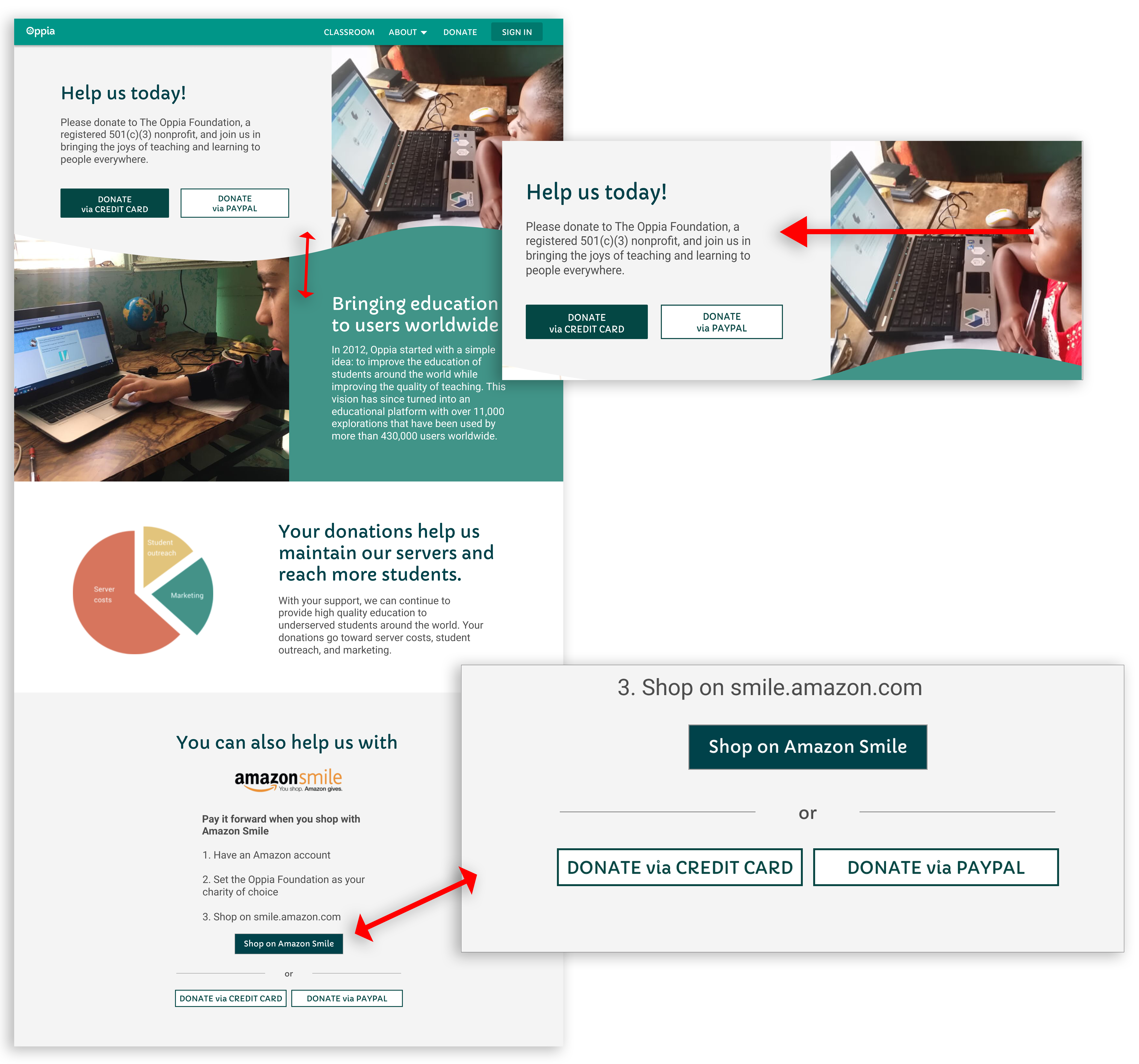
First problem I faced with my first approach was raised by my project coordinator, “what if people don’t scroll down?”.
Rearrangements had to be done. I moved content, used different copy but still maintained the same idea. The hierarchy changed, I moved the CTA's for the front row (which reemphasized them as the Main Characters of the Page), and maintained the same structure for the following sectors.
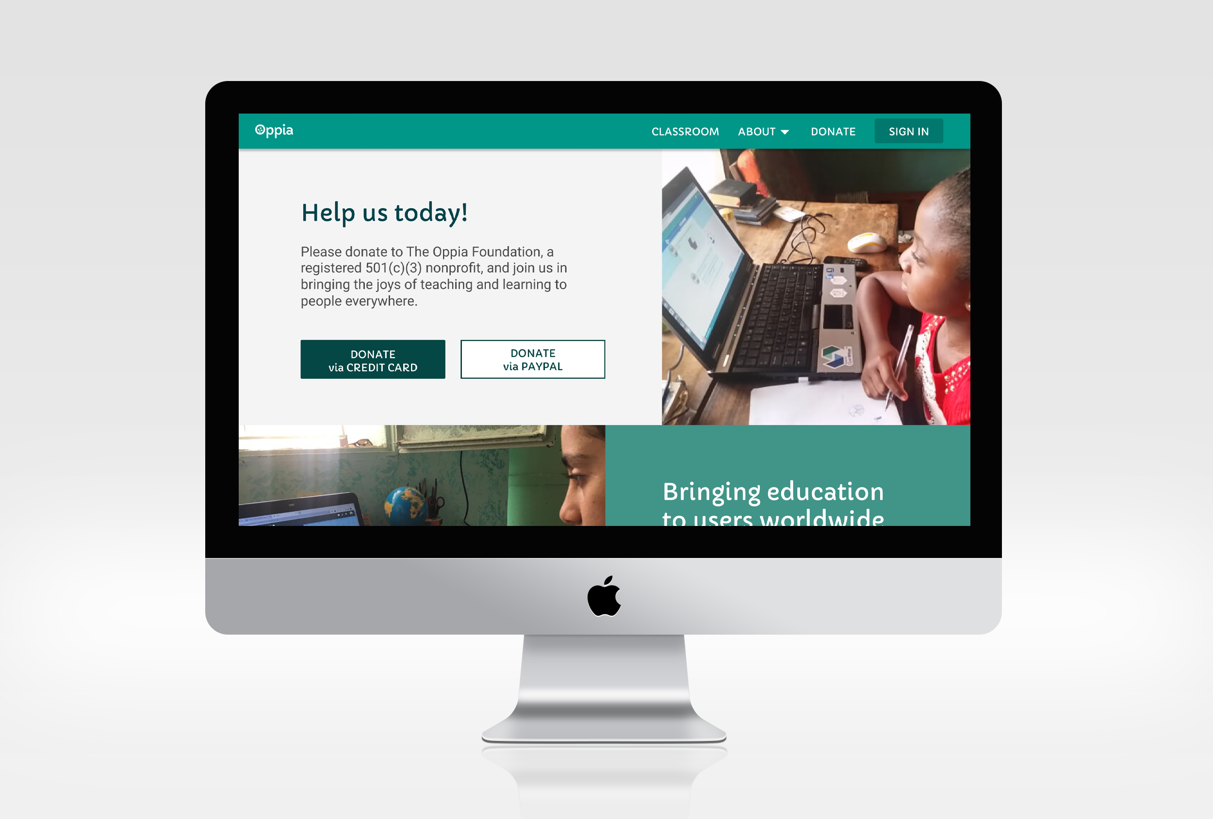
After the first presentation to the full team, some other suggestions were made about emphasizing again at the bottom of the page, the previous CTA's for donation. Treating it as a final reminder and last note, I group them together with the existing Amazon Donation CTA, but dropping them for the second plan.
Second Problem
After many iterations, the final meeting came, and with the developers came another problem. Due to technical limitations I had to drop the organic shape connecting both sections into one.
Although it was a commitment I had to make, I think the overall process, experience and flow of the content wasn’t very affected.
Conclusion
Usus est magister optimus - "Practice is the best teacher."
My redesign of the page, with the help of my coordinator and rest of the team was a great experience.
It was the first time I was faced with the technical constraints that led me to make some concessions, but I strongly believe that in projects or life in general, it’s all about negotiating your positions and opinions. Sometimes you can get all of them through, other times, you cannot.
The thing that I enjoy the most, is knowing that the success of my effort, will translate into more money being channelled into teaching children in need, allowing them to learn more and better. With Oppia, learning is the key word, for me and for the users. By the way, wouldn’t you like to make a donation? :)