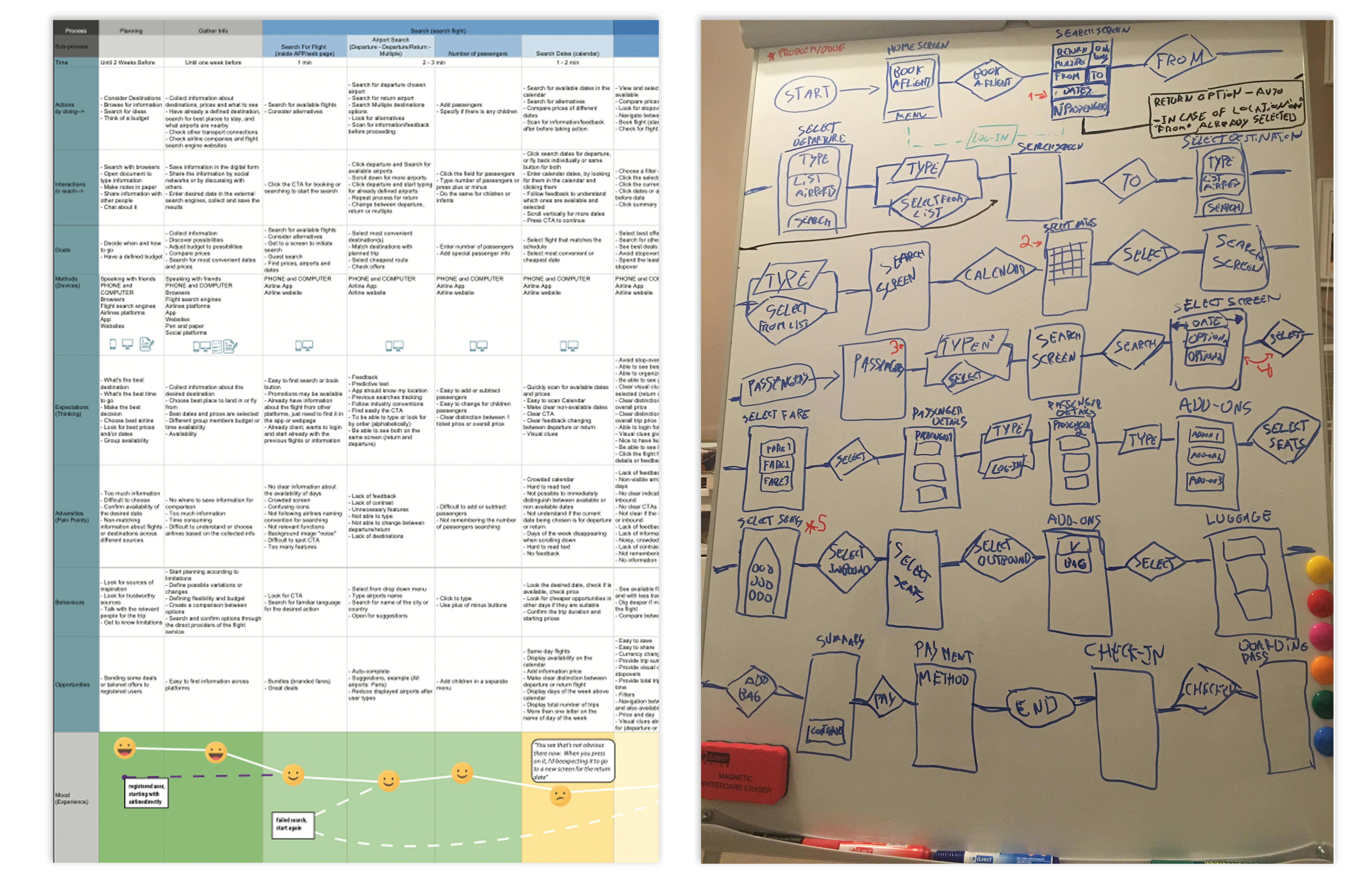
Fly UX – Case Study

1. Introduction - Fly UX

The project's foundation is an iOS app called Fly UX, aimed at providing an immersive experience for adventure enthusiasts. Using Agile methodology, the project ensures iterative progress and quick adjustments to user feedback, thereby ensuring a user-centered design process.

Process

The overall process involves four stages: research, analysis, design, and testing. Each stage is iterative, ensuring constant refinement and improvement of the user experience. The project leverages various tools such as Sketch, InVision, and user testing platforms to validate the designs and collect actionable feedback.

Challenges & Solutions

User Research & Goals

Competitive benchmarking, Online survey, Note-taking, Usability test.

Research was fundamental to understand the problems we are attempting to solve for users. Covered a range of research techniques, including the core skill of usability testing, such as interviewing, card sorting, online surveys and heuristic evaluation.

Workflows

Interaction design for mobile.

Using the data and materials from previous parts of the project, such as the "Customer journey map", I was able to draft a flow diagram for mobile. Although working on previous developed materials, this part of the project made me realise that some aspects needed change. Created a low fidelity prototype, based on the flow diagrams and sketches.

Prototyping and Wireframing

Adding more detail in the form of interactivity,extra details for developers.

Creation of a medium fidelity prototype, using the low fidelity prototype and new sketches. During the wireframes, I've addressed every question that may arise from the prototype, helping the developers build the product accurately.

Fly UX Testing
"Fly UX - Redefining adventure experiences."

2. User Research

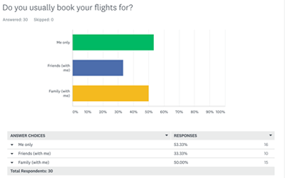
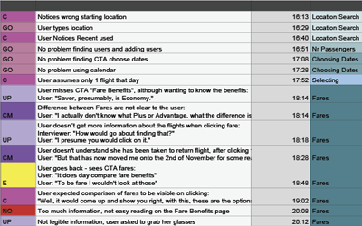
The user research stage was essential for identifying problems and pluses from competitors and creating a goal oriented approach for my project. The competitive benchmark allowed me to identify industry standards; the survey was useful to define the goals and the note-taking to point out pain points and expected app behaviours. The reason why I chose Ryanair, Easyjet, Qatar Airlines and Emirates was to have different perspectives on the low cost and luxury market.

User Research
Image 1

Competitive benchmark

Competitors analysis.

Identified what the competitors are doing right, and learn from what they are doing wrong. For this, I’ve reviewed four mobile apps to gain some insights on how best to design the airline app.

Image 2

Survey

On-line Survey.

Gathered data on online behaviour using Airline services (booking, searching, paying, etc). With a mix of closed and opened questions I was able to understand purchasing behaviours and user priorities.

Relevant findings:

- 80% browse for flights in a search engine
- 70% buy flights in the website vs 3% in an App
- 80% use a registered user profile

Image 3

Note-taking

Understand users emotions.

Often overlooked as a core skill for UX professionals but good notes are a fundamental part of research. When taking notes my job is to highlight the key insights from the session: anything which will help me make decisions about my design choices later on.

"Fly UX - Redefining adventure experiences."
Fly UX Testing

During the usability testing I was able to identify:

3. User Goals

Flow diagram for mobile

My process was divided in four stages. Initial screen sketching, sketching inside mobile layout, screens for testing inside a mobile layout prototype and final screen problems addressed.


Prototyping

Testing

Making sure the prototype contains enough detail and interactivity to test the high-level flow, screen layouts, text, and basic interactions.


Tools

Developed using Sketch.


Mid-fidelity Prototype

Based on the previous flow diagrams and sketches.

Medium Fidelity Prototype

Wireframes screen 1

Wireframes

Clarifying all the interactions and scenarios for all the screens.

Including buttons, transitions, animations and navigations between screens. This process takes part between the prototype and building the app stage. Like in a blueprint I provided all the necessary information at this stage, taking into consideration that I’ve based this in a medium fidelity, some aspects like colour are not addressed.

This project serves as complement to the prototype project, providing additional information, such as error messages or button availability, in order for the developers to have all the necessary materials to build the app.

Conclusion

The final design of Fly UX is highly appreciated by stakeholders and users alike. The iterative process helped create a highly engaging and user-friendly experience, making it easy for users to book and manage their adventures seamlessly. The app is expected to launch soon, setting a new standard for adventure booking platforms.